
The professional email signature guide
What belongs in a professional email signature, what to cut, and how to build one that survives Outlook, Gmail and a 320px phone screen. The long version.
Your signature is the only part of your email that goes out unchanged thousands of times, and it is usually the part nobody ever revisits. It was set up once, on a laptop, in a hurry, and it has been quietly representing you ever since.
This is the long version of how to fix that: what belongs in a professional email signature, what to leave out, how to build one that survives Gmail, Outlook and a phone screen, and which decisions actually matter versus which are taste.
What a signature is for
A signature answers three questions the reader may have at the moment they finish reading: who is this, what do they do, and how do I reach them without hunting. That is the whole job.
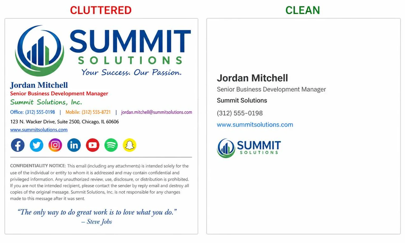
Everything else — the quote, the eight social icons, the "please consider the environment" plea — is competing with those three answers. A signature is not a landing page. It is not a billboard. It is a sign-off with contact details attached, and it earns its keep by being fast to scan.
The failure mode is almost never "too plain." It is "too much," which is a different problem than most people expect.
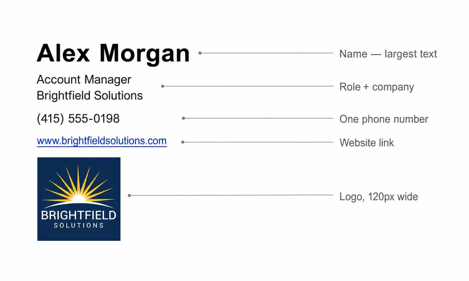
The anatomy of a professional email signature
Name and role
Your full name goes first and is the largest element — usually 16 to 18px, bold. Then role and company on one or two lines at 13 to 14px. If your job title is a nine-word internal construction, shorten it to something a stranger can parse. "VP, Strategic Partnerships & Ecosystem Enablement" is an org chart artifact, not a description.
Contact details
One phone number. Not office plus mobile plus a Teams handle plus a fax line that has not been connected since 2014. Pick the number you actually answer.
Your email address is optional and frequently redundant — the reader is looking at an email from you, and every client shows the sender address. Include it when your messages get forwarded a lot, or when you send from an alias that differs from your reply-to.
Website and logo
Link the site with a readable label rather than a raw URL. Keep the logo modest: 120 to 200px wide, PNG for anything with transparency, and served from a stable HTTPS URL that will still resolve in two years. Export at 2x the display width and set the HTML width attribute to the intended size, or the logo will look soft on retina screens.
Everything after that
Pronouns are a one-line addition and cost nothing. A headshot works for anyone selling themselves rather than a company. Social icons are the most over-used element in the entire format: two links, at most, and only the ones where you actually post.
Legal disclaimers are a compliance decision, not a design one. If your employer requires one, it goes last, small, grey, and you stop arguing about it. If nobody requires one, you do not need it. A confidentiality notice appended to a message you already sent to the wrong person has no legal effect worth the pixels.
Inspirational quotes have never made anybody more likely to reply.
What to include, by role
Recommendations, not research. Adjust for your industry, but be honest about whether you are adjusting or just attached to something.
| Element | Founder | Sales rep | Freelancer / agency | Corporate employee |
|---|---|---|---|---|
| Full name | Include | Include | Include | Include |
| Job title | Include | Include | Optional | Include |
| Company name | Include | Include | Include | Include |
| Phone | Optional | Include | Optional | Optional |
| Email address | Skip | Optional | Optional | Optional |
| Website | Include | Include | Include | Optional |
| Logo | Include | Include | Optional | Optional |
| Headshot | Optional | Include | Include | Skip |
| Social icons | Optional | Optional | Include | Skip |
| Booking link | Optional | Include | Optional | Skip |
| Pronouns | Optional | Optional | Optional | Optional |
| Legal disclaimer | Skip | Skip | Skip | Include if required |
| Inspirational quote | Skip | Skip | Skip | Skip |
Two patterns are worth naming. Corporate employees should skip most of it, because internal mail is 90% of their volume and nobody in the next room needs your Twitter. Freelancers should keep the headshot, because when you are the product, a face outperforms a logo.
Building one that actually renders
This is where most signatures fall apart, and it is entirely a technical problem.
Tables, not divs
Email clients are not browsers. Outlook on Windows renders HTML through Microsoft Word's engine, which ignores float, flexbox, grid, and most positioning. Gmail strips `<style>` blocks in many contexts, so CSS has to be inline on each element. The reliable layout primitive is a `<table>` with inline styles — the same technique that has worked since the format stabilized, unglamorous and unavoidable.
Fonts follow the same logic. Web fonts do not load in most clients, so specify a stack of Arial, Helvetica, sans-serif and accept that your brand typeface will not survive the trip. Set explicit colors on every text element, because a client that finds no color will pick one, and in dark mode it may pick badly. The rendering rules worth knowing in detail cover contrast ratios, dark-mode inversion and the reply-chain behavior that makes signatures stack.
Do not ship it as one image
The most common shortcut is exporting the whole signature as a PNG and pasting that. It looks perfect in the design tool and fails everywhere else.
Images are blocked by default for external senders in Outlook and are commonly off elsewhere. When they are blocked, an image-only signature becomes an empty grey box: no name, no phone, nothing selectable, nothing clickable. Screen readers get whatever alt text you remembered to write, which is usually none. Text inside an image cannot be copied, searched, or resized. This is the full case against image-based signatures, and it is one-sided.
Use images only for what images are for: a logo, a headshot. Everything with information in it should be live text.
Width and mobile
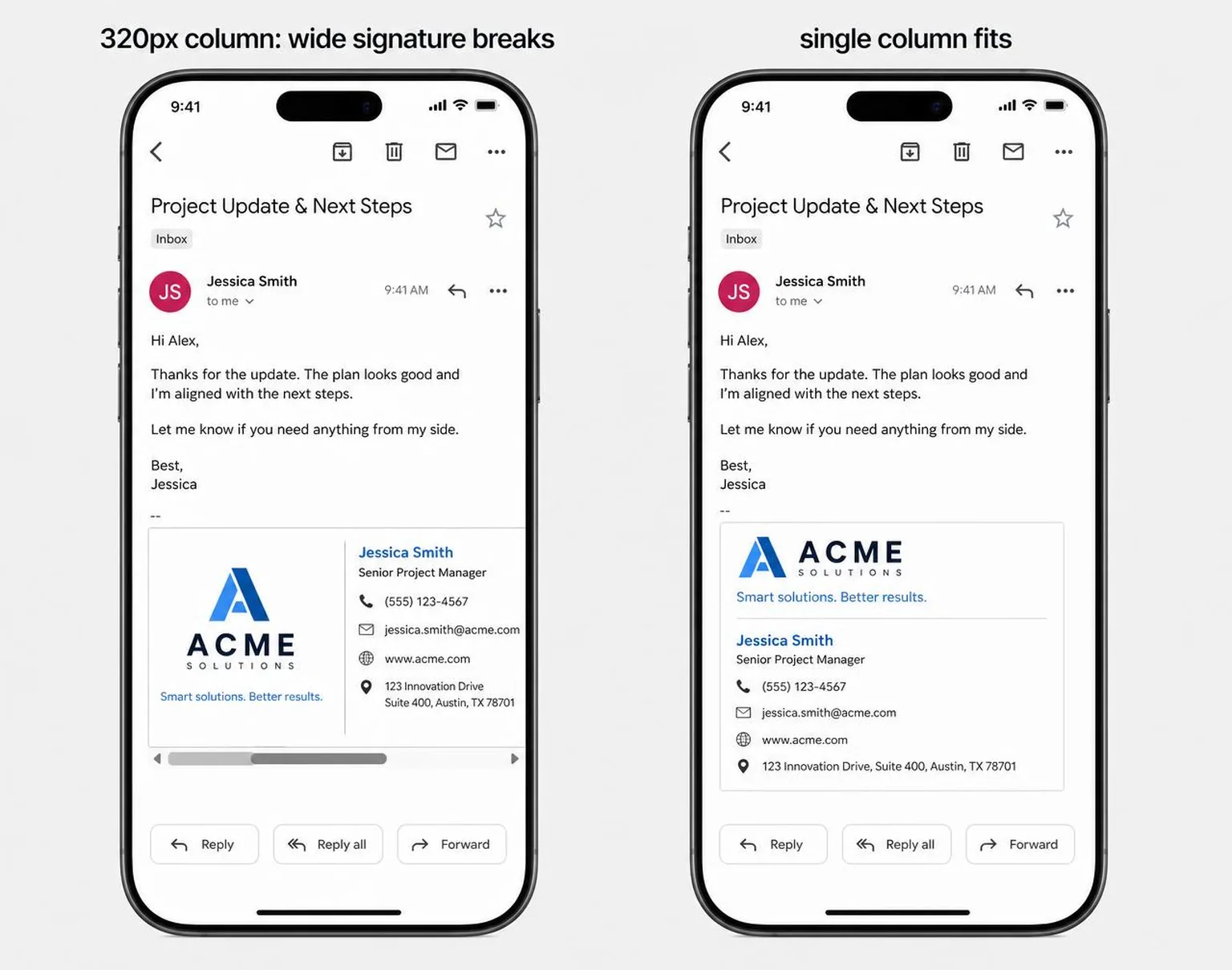
Cap the total width at around 600px, and design as if it will be seen at 320. A two-column layout with a logo beside the text is fine on desktop and can force horizontal scrolling on a phone if the columns have fixed widths that do not add up.
The safest structure is a single column: logo, then name, then details, stacked. If you want two columns, keep the text column flexible and the image column fixed, and test it on an actual phone rather than a narrowed browser window.
Keep total signature weight low. A 40KB logo is fine; a 900KB headshot is a rendering delay on every message you send, and Gmail clips messages over roughly 102KB, which can hide your signature behind a "view entire message" link.
If assembling table HTML by hand sounds like a bad evening, generate a signature from your website and paste the result straight into Gmail.
Booking links, without the pressure
A calendar link is genuinely useful in the right context and mildly rude in the wrong one. The dividing line is who wants the meeting: if the reader is chasing you, a link saves them a round trip; if you are chasing them, the link asks them to arrange a meeting they have not agreed to.
Label matters more than placement. "My calendar" is a statement of availability. "Book a time now" is an instruction. Keep it as a plain text link rather than a button, because buttons are usually images and disappear with images off. The longer argument about booking link etiquette covers cold outreach, internal mail and where the link belongs when it is not in the signature at all.
What a signature does to deliverability
A signature is part of the message body, so spam filters read it like everything else.
Three things reliably hurt. Tracking pixels and click-tracking that rewrite your links into an unfamiliar redirect domain make a plain message look like marketing, and a recipient who hovers sees a hostname that is not yours. A high image-to-text ratio has the same effect, which is another reason the all-in-one PNG is a bad idea. And link mismatches — anchor text saying one domain while the href points to another — are the exact pattern phishing filters exist to catch.
Two things help. Send links to the same domain you send mail from, wherever possible. And keep the HTML simple: fewer nested tables, no `<script>`, no embedded forms, no `<iframe>`. None of that renders in mail clients anyway, and its presence is a signal.
If you use a corporate mail gateway that appends its own disclaimer after your signature, check what it emits. Some append plain text below your HTML block, which breaks the visual grouping and can leave an orphaned line under your logo. You cannot always change it, but you can stop your own signature from ending in a way that makes the seam obvious.
Mistakes that survive redesigns
Some problems persist through every signature refresh because they do not look like problems.
Multiple signatures drifting out of sync is the classic one. You update the desktop version, forget mobile, and start sending two different job titles depending on which device is nearest. Set both, or set neither.
Then there is the reply-chain stack: a full signature on every message in a twelve-message thread means twelve logos in the quoted history. Most clients let you configure a shorter signature for replies. Use it.
And the slow rot: a link to a redesigned site that now 404s, a phone number from a previous office, a logo hosted on a personal Dropbox that expired. Signature content ages badly because nobody reads their own. The mistakes that quietly cost you replies go through these in detail, including the ones that look deliberate.
A workable process
Write the text first in plain text, with no styling. If it reads well as five lines in a notepad, it will read well styled. If it needs styling to make sense, it is too long.
Then build the HTML, paste it into Gmail's signature editor, and send yourself a test. Open the test on a phone, in a desktop client, and with images turned off. Reply to it once so you can see what the signature looks like inside a quoted thread.
Set a reminder to look at it again in six months. That is the entire maintenance burden, and skipping it is why so many signatures list a phone number that rings in an empty room.
Related reading
- Common signature mistakes — the failures worth auditing for first
- Why image-based signatures fail — the case against pasting a PNG
- Adding a booking link — the etiquette of putting your calendar in your signature
- When an HTML signature renders wrong — broken images, collapsed Outlook tables, phone overflow, and the fix for each.
- How to add a signature in Outlook (all four versions) — where the setting lives in each Outlook, and how to paste HTML without it collapsing.