Booking link etiquette: when a calendar link helps and when it grates
A booking link in your signature is a courtesy or a demand depending on who wanted the meeting. Labels, placement, cold outreach, and the two-signature fix.
You want people to book time with you without having to trade four emails to find a slot. You also do not want your signature to read like a sales funnel attached to a human being.
That tension is the whole subject. A booking link is a convenience or a demand depending on who wants the meeting, how the link is labeled, and where it sits. The mechanics are trivial. The etiquette is not.
The one rule that decides everything
A booking link is helpful when the reader already wants time with you. It is presumptuous when you want time with them.
That is the test. Run every case through it.
If someone emails asking about your consulting rates, a calendar link saves them the scheduling volley. If you email a stranger to pitch them and end with "grab a slot," you have asked them to do the work of arranging a meeting they did not agree to. The link is identical. The read is completely different.
When you are the one asking
Propose times in the body of the email. Two or three specific windows, with your time zone. Then let the signature link sit there quietly as a fallback for someone who would rather self-serve.
The signature link is the polite version because it does not require action. The body-copy "book a time" is the pushy version, because it does.
When they are the one asking
Be obvious. Put the link in the reply itself, in a sentence, not buried in the sig block. "Easiest is to pick a time here" is a service. Making a warm lead scroll past your legal disclaimer to find a calendar URL is not.
Labeling: what you call it changes what it means
Same URL, three very different tones.
"My calendar" — the safest default. It is a statement of availability, not an instruction. It works in cold outreach, in replies, and in internal mail without reading as a pitch in any of them.
"Book a time" — an imperative. Fine when the meeting is already agreed. Slightly grabby when it is the first thing a stranger reads from you.
A bare pasted URL — `calendly.com/yourname/30min`. Reads as unfinished. It also wraps badly in narrow columns and looks like the trailing debris of a copy-paste. Some clients auto-link it, some do not, so the styling is inconsistent.
"Schedule 15 minutes" — better than most, because the number sets the price. People agree to fifteen minutes faster than they agree to an open-ended slot.
Avoid anything with urgency in it. "Grab a slot before they fill up" is a webinar tactic, and everyone recognizes it.
Text link or button
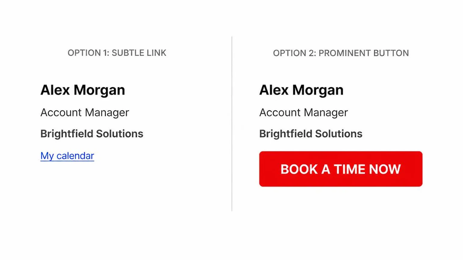
Buttons in signatures are a bad trade. They are built from images or from table cells with background colors, and both of those degrade in ways plain text does not.
Gmail's clipping, Outlook's Word rendering engine, and dark mode inversion all treat a colored block worse than they treat a link. If your button is an image, it disappears entirely when images are blocked — which is the default in Outlook for external senders and common everywhere else. A reader then sees a grey placeholder box where your call to action was, and no clue what it said. This is the same failure mode that makes image-based signatures unreliable in general.
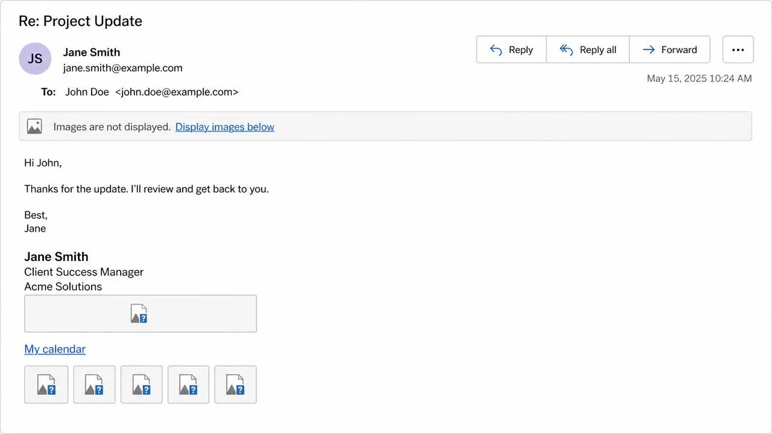
A plain `<a>` with a color and an underline works in every client, renders in dark mode, is readable by screen readers, and cannot be blocked. Keep the color at 4.5:1 contrast against white so it stays legible when a client strips your styling — the rendering standards worth respecting apply here too.
Where to put it
| Placement | How visible | How pushy it reads | Survives image blocking | Best for |
|---|---|---|---|---|
| Plain text link on its own line | Moderate | Low | Yes | Default for almost everyone; consulting, recruiting, support |
| Styled CTA button | High | High | Only if built in HTML, never if it is an image | Sales reps whose entire job is booking demos |
| Appended to the job title line | Low | Very low | Yes | Internal mail and long client threads where you do not want to advertise |
| Icon with no label | Low | Low | No — vanishes with images off | Nothing; the calendar icon is not universally understood |
| Bare pasted URL | Moderate | Medium | Yes | Plain-text-only senders and mailing lists that strip HTML |
| Not in the signature; in the body instead | Highest in context | Low, because it is invited | Yes | Replies to someone who explicitly asked to meet |
The last row matters more than the rest. The most effective placement for a booking link is frequently not the signature at all. It is one sentence in the message, written for that specific reader, at the moment they need it.
Should it be in every email
No — but the alternative costs you nothing, so decide deliberately.
Most people run one signature everywhere, which means the calendar link goes to their mother, their landlord, and a thread with fourteen colleagues arguing about a deploy. It becomes a problem in two places: internal mail, where a booking link to teammates reads as self-important, and long reply chains, where it stacks up four times in the quote.
The practical fix is two signatures. A full one for new external threads, a two-line one for replies and internal mail. Most clients support multiple signatures with per-account or new-versus-reply defaults. Set it once.
If you would rather not hand-edit HTML for both versions, build them from your website in a minute and paste the results into Gmail.
Cold outreach, specifically
In cold email, the booking link's job is to be findable, not to convert. Put it in the signature as text, keep the label neutral, and let the body of the email do the persuading.
Three things to avoid. Do not put the link in the first line. Do not include both a body-copy CTA and a signature button — that is two asks for one meeting. Do not use link tracking that rewrites the URL into a redirect domain, because spam filters weigh unfamiliar redirect hosts, and a recipient who hovers sees a domain that is not yours.
With people you already work with
Drop the ceremony. Colleagues and long-standing clients already know how to reach you, and a persistent CTA in every message reads like you are managing them.
Use the short reply signature, and when scheduling actually comes up, paste the link into the sentence where it belongs. If your full signature is doing too much work in the first place, the most common signature mistakes are a decent audit checklist before you add one more line to it.
A booking link is one line of a larger decision. The complete professional email signature guide covers the rest of what belongs on those four or five lines.
Related reading
- The complete professional signature guide — every element, by role
- Common signature mistakes — an audit checklist before you add another line
- Signature best practices — how to make the link survive dark mode and image blocking