
7 email signature mistakes that quietly cost you replies
Seven ways a sign-off loses you responses — bloat, blocked images, CSS that Outlook deletes, dead links — with the mechanism behind each and a fix you can apply now.
Your emails are getting read and not answered, and you have started to suspect the sign-off. You are probably right: the last four lines of a message do more work than most people give them credit for, and a bad signature makes a reply feel like more effort than it is.
A signature is not decoration. It is the part of the message where the reader decides who you are, whether you are worth a calendar slot, and how to reach you if they say yes. When it fails, it fails quietly. Nobody writes back to tell you your logo didn't load.
Below are the seven email signature mistakes that cost the most replies, what each one actually looks like in a real inbox, the mechanism by which it does damage, and a fix you can apply before your next send.
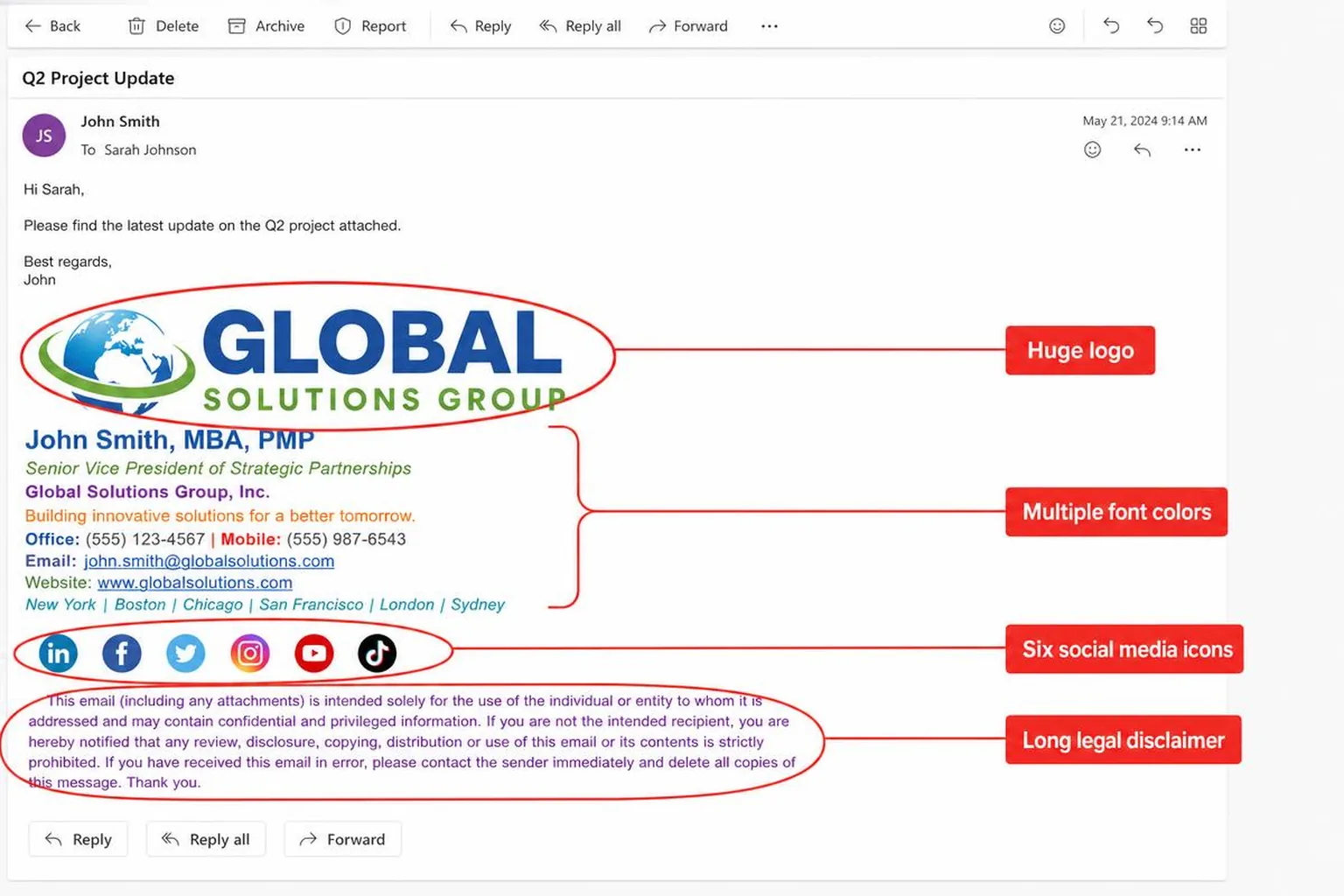
1. The signature is longer than the email
What it looks like
Three lines of message. Twelve lines of signature. A logo, a tagline, an office address, a mobile number, a landline, a fax number that has not rung since 2014, six social icons, a "we're hiring" banner, and a confidentiality notice inherited from a legal team you have never met.
Why it costs replies
Reply decisions happen fast, and they happen on a scroll. A long signature pushes your actual ask off the first screen, especially on mobile where the visible area is a few hundred pixels tall. Worse, in a threaded conversation the signature repeats on every message, so a five-email exchange carries sixty lines of boilerplate. Readers start skimming past the bottom of your messages entirely — which is exactly where your booking link lives.
The fix
Cap it at four lines. Name, role plus company, one contact method, one link. Everything else has to earn its place by displacing something. If you cannot decide, delete the office landline and the tagline first; neither has ever produced a reply.
2. The whole signature is one image
What it looks like
A designer sent you a beautiful PNG. You pasted it in. It looks perfect in your sent folder.
Why it costs replies
Outlook on Windows, most corporate mail clients, and Gmail for recipients outside your domain routinely block remote images by default until the reader clicks "display images." When that happens your signature becomes an empty grey rectangle. Nothing is clickable, nothing is selectable, and nothing is searchable — a recipient who tries to find your phone number by searching their inbox will find nothing, because there is no text in the image. Screen readers get whatever alt attribute you set, which is usually none.
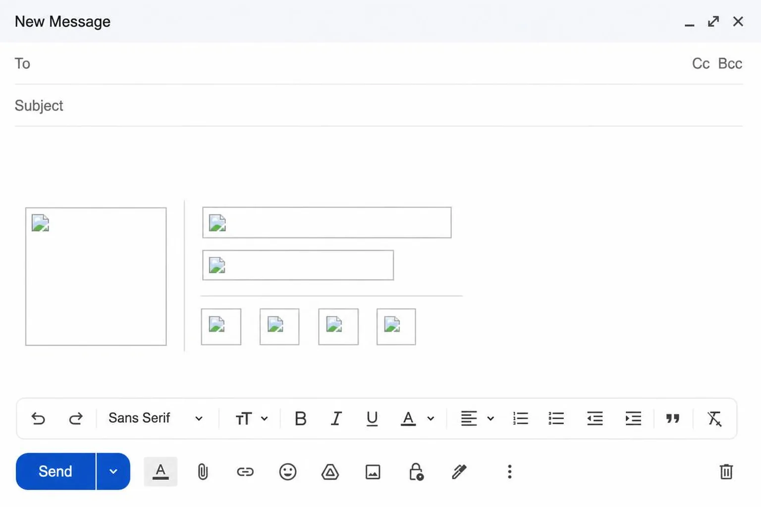
The fix
Build the signature as HTML text with an HTML table for layout, and use images only for the logo or headshot. We go through the failure modes in detail in why image-based signatures break in real inboxes, but the short version: if a piece of information matters, it must be selectable text.
3. Images without absolute URLs or dimensions
What it looks like
Your logo shows up on your machine and nowhere else, or it arrives at four times its intended size and shoves the layout sideways.
Why it costs replies
Email clients do not resolve relative paths. A src of "/logo.png" means nothing outside your website; the image has to be hosted at a full https address that is publicly reachable without a login. Separately, if you omit width and height attributes, the client renders the image at its native pixel size — a 1200px logo becomes a 1200px logo, and your carefully arranged table explodes. Retina displays make this worse: you want a 2x asset scaled down, which only works if you declare the display size.
The fix
Host the image on a public HTTPS URL. Set width and height as HTML attributes on the image tag, not only in CSS — Outlook's rendering engine ignores plenty of CSS but respects attributes. Keep logos under about 200px wide and headshots around 80–100px square. Always write a real alt attribute, so the blocked-image version still reads as your name.
4. Styling that the receiving client silently deletes
What it looks like
Rounded corners, a background gradient, a flexbox column layout, a Google Font, a box shadow. Pristine in the editor, mangled on arrival.
Why it costs replies
Mail clients are not browsers. Gmail strips style blocks in some contexts and ignores external stylesheets entirely. Outlook on Windows renders HTML with Microsoft Word's engine, which does not support flexbox, grid, reliable floats, or background images. Custom web fonts do not load; the client falls back to something you did not choose. The result is not a slightly different signature — it is a stack of unstyled text in the wrong typeface, which reads as "sent from a broken system" rather than "sent by a professional."
The fix
Inline every style attribute directly on the element. Use nested tables for layout instead of divs. Stick to the fonts that exist everywhere: Arial, Helvetica, Georgia, and the generic sans-serif fallback. If you would rather not hand-write table markup, generate the signature from your website and paste the result straight into Gmail.
5. Vague or missing identity
What it looks like
"Best, Sam" and a phone number. Or the opposite: "Sam Whitfield, MBA, PMP, CSM, Senior Vice President of Strategic Partnerships and Ecosystem Development, EMEA."
Why it costs replies
A recipient deciding whether to answer is asking two questions: who is this, and should I care. A bare first name answers neither, and forces them to scroll up the thread or search their CRM — friction that converts a "yes" into a "later." A twelve-word title fails differently: it signals hierarchy rather than relevance, and nobody can tell from it what you would actually be useful for.
The fix
Full name, then a role a stranger can parse in one read. "Head of Partnerships" beats "SVP, Strategic Partnerships & Ecosystem Development." Drop the certification alphabet unless the credential is the reason someone is emailing you.
6. Links that go nowhere useful
What it looks like
A LinkedIn icon pointing at linkedin.com rather than your profile. A www.company.com written as plain text instead of a hyperlink. A booking link that opens a page listing no availability for eleven days.
Why it costs replies
Every broken or generic link is a dead end at the exact moment the reader had momentum. The booking case is the expensive one: someone who wants to talk to you and hits an empty calendar does not send a follow-up asking for other times. They close the tab. There is a whole etiquette to placing a booking link without seeming pushy, and the first rule is that the calendar behind it has to be honest.
The fix
Click every link in your own signature from a logged-out browser window. Deep-link social profiles or remove the icon. Make sure your domain is an actual anchor tag. Confirm your booking page offers slots this week.
7. It falls apart on a phone
What it looks like
A two-column table that wraps into a jumble, a headshot that pushes the text off-screen, 10px grey type on a white background.
Why it costs replies
A large share of first reads happen on a phone, and a signature that requires horizontal scrolling reads as sloppy before it reads as anything else. Small light-grey text — the classic #999999 at 10px — is unreadable in daylight and fails contrast guidelines. Dark mode compounds it: many clients invert backgrounds but not images, so a logo with a baked-in white background lands as a bright rectangle in a dark message.
The fix
Keep the layout to a single column, or one narrow image column plus one text column with a total width under about 500px. Minimum 13px type. Use a dark grey such as #333333 for body text rather than light grey. Save logos as transparent PNGs so dark mode does not frame them in white.
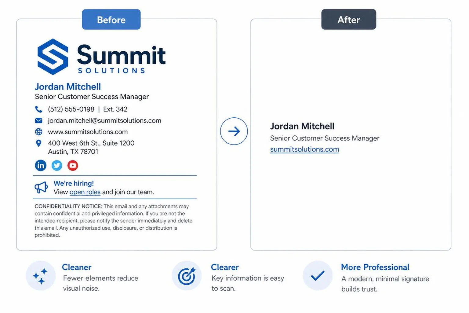
The seven mistakes at a glance
| The mistake | Why it costs you replies | The fix |
|---|---|---|
| Signature longer than the email | Pushes your ask off the first mobile screen | Cap at four lines |
| Whole signature as one image | Blocked images leave a grey box, no clickable text | HTML text plus a small logo |
| Relative URLs, no dimensions | Broken or giant images wreck the layout | Public HTTPS URL, width and height attributes |
| Modern CSS and web fonts | Outlook and Gmail strip it, output looks broken | Inline styles, nested tables, Arial or Helvetica |
| Vague name or bloated title | Reader cannot place you, so they defer | Full name plus a plain-language role |
| Dead or generic links | Kills momentum at the moment of intent | Test every link logged out |
| Breaks on mobile or dark mode | Sideways scroll and unreadable grey text | Single column, 13px minimum, transparent logo |
Fix it in five minutes
Send yourself a test message and open it on your phone, in Outlook if you have access, and with images blocked. Count the lines. Click every link. If any single one of those three checks embarrasses you, you have found the thing that has been costing you replies — and it is almost always the images.
If you are rebuilding from scratch rather than patching, the complete guide to a professional email signature covers the whole structure before you start deleting lines.
Related reading
- Why image-based signatures fail — the single mistake above, explained in full
- Signature best practices — the widths, fonts and fallbacks that render everywhere
- The complete professional signature guide — what belongs in a signature, by role
- When an HTML signature renders wrong — broken images, collapsed Outlook tables, phone overflow, and the fix for each.