
Email signature best practices: the rendering standards
Widths, file weight, logo formats, safe fonts, contrast ratios, dark mode, and reply chains — the technical standards that make a signature render the same way in Gmail, Outlook and Apple Mail.
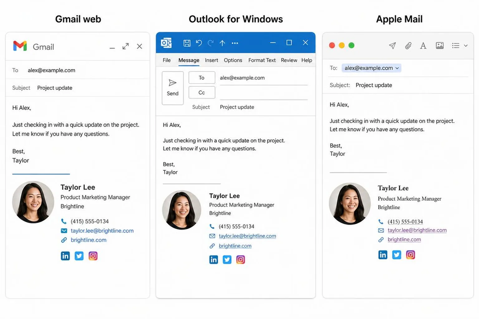
Your signature looks right in Gmail, and then someone forwards your message to a colleague on Outlook for Windows and it arrives as a stack of misaligned text in a font you did not choose. The design was never the problem. The rendering was.
This is the standards article: widths, weights, formats, fonts, contrast, and what happens on the fifth message in a thread. None of it is subjective. Email clients have documented behaviour, and a signature that respects it renders correctly nearly everywhere.
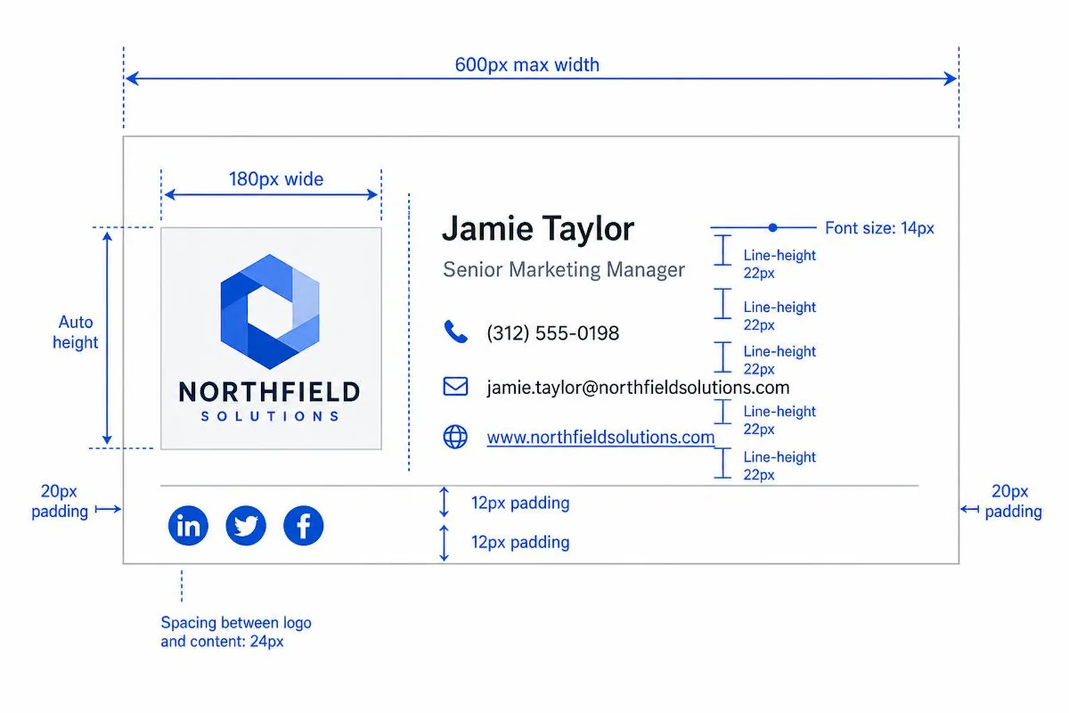
Width: 600px is the ceiling, 500 is safer
Reading panes are narrow. Outlook's default three-column layout leaves a message area a few hundred pixels wide on a laptop, and 600px is the long-standing convention for email content because it fits that pane without horizontal scroll. For a signature, treat 600px as the absolute maximum and aim for 500 or less. A signature is not a newsletter; it does not need the full width.
Set the width on the outer table with a width attribute, not only CSS, and never use a percentage-only width with no max-width — Outlook will happily stretch it.
Two columns or one
If you use a logo or headshot beside your text, that is one narrow image column plus one text column. Keep the image column to its exact pixel width and let the text column take the rest. More than two columns will collapse unpredictably on a phone, because media queries are ignored in Outlook for Windows and mobile clients wrap columns differently.
File weight: keep the whole thing under 50 KB
Your signature ships with every message you send, including every reply in a thread. The markup itself should be tiny — a well-built HTML signature is a few kilobytes of text. The images are what costs you.
A sensible budget: logo under 20 KB, headshot under 30 KB, everything together under 50 KB. Gmail clips messages larger than 102 KB and shows a "View entire message" link, which cuts off the bottom of the email — where your signature lives. That threshold is easy to hit in a long thread if each message carries a heavy signature.
Logo dimensions and format
Export at twice the display size and constrain with attributes. A logo shown at 180px wide should be a 360px asset with width="180" on the tag. Use PNG with a transparent background, or JPG if the logo is photographic and has no transparency. Headshots run 80–100px square at display size, so 160–200px exported.
SVG is not usable in email. Neither Gmail nor Outlook renders it. WebP support is inconsistent enough that it is not worth the risk. PNG and JPG only. This is also why the sane approach is live text plus a small image, rather than exporting the whole signature as a picture.
Fonts: pick from the list that exists everywhere
Web fonts do not load in Gmail or in either Outlook. The client falls back to whatever it considers default, which means your carefully chosen typeface becomes Times New Roman on someone's machine. There is no workaround worth the complexity.
Safe stacks, in practice:
- Arial, Helvetica, sans-serif — the default choice
- Helvetica, Arial, sans-serif — same thing, Mac-first
- Georgia, Times New Roman, serif — if you want a serif
- Verdana, Geneva, sans-serif — wider, easier to read small
Set the font on every single element. Outlook does not reliably inherit font styles through table cells, so a font-family declared once on a wrapper will not survive.
Body text at 14px, secondary lines no smaller than 13px. Below that you are asking people to squint at a phone in daylight.
Colour and contrast
The house style for signatures is small grey text, and most of it fails accessibility. WCAG AA requires a contrast ratio of 4.5:1 for normal text. The popular #999999 on white lands around 2.8:1. It does not pass.
#666666 on white is roughly 5.7:1 and passes comfortably. #555555 is safer still. Use a genuinely dark colour such as #222222 for your name, mid-grey for the supporting lines, and keep your brand colour for links only — where the underline carries the meaning anyway, so colour-blind readers are not relying on hue.
Dark mode
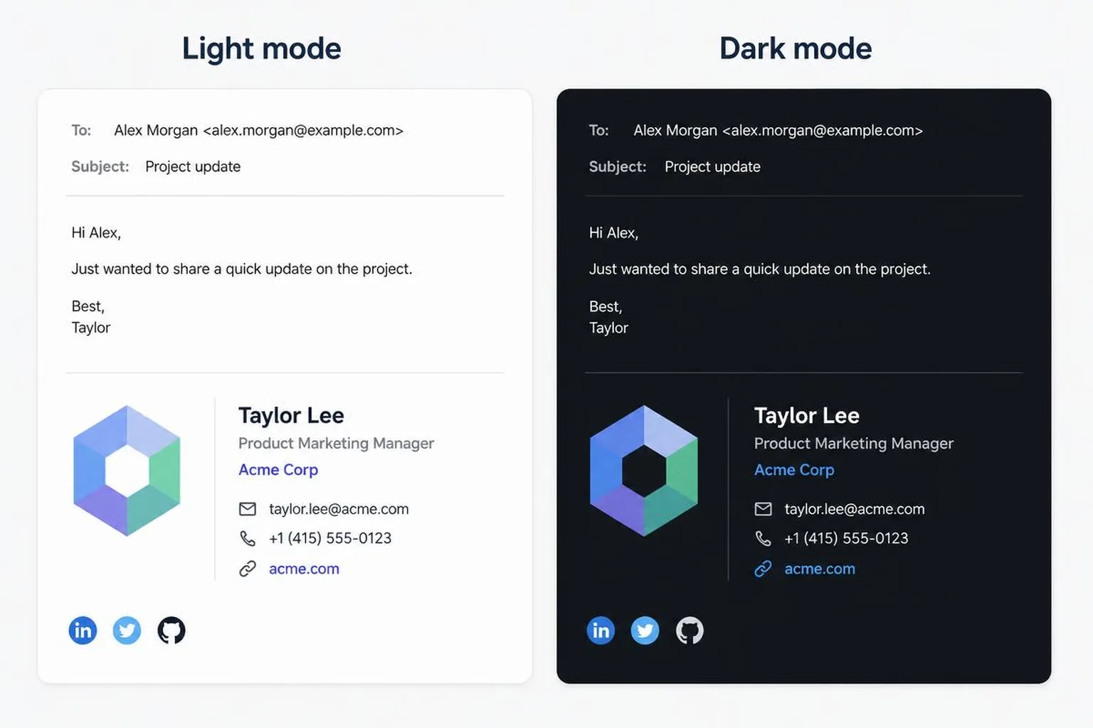
Apple Mail and Outlook for Windows apply full colour inversion to messages in dark mode. Gmail applies a partial treatment that varies by platform. You cannot control this, so design for it.
Three rules. Never bake a white background into a logo file; use transparency so the client's background shows through. Never rely on a white background for legibility — if your text is dark grey on a white table cell and the client inverts the cell but not the text, you get dark on dark. And test with an actual dark-mode client rather than trusting a preview.
How many links is too many
Four. A website, one social profile, one email or phone that is genuinely clickable, and a booking link if you use one. Past that, each additional link reduces the odds that any specific link gets clicked, and a wall of social icons reads as a marketing footer rather than a person.
Every link needs a full absolute URL including the scheme. www.example.com without https:// is either not linked at all or linked to a relative path that resolves to nothing. Use mailto: for email and tel: for phone numbers so mobile clients dial directly. If you include a calendar link, the rules for placing a booking link without being pushy apply.
Reply chains
This is the part people forget. Your signature is not shown once; it accumulates. A ten-message thread contains ten copies of it, and every one of them is pushing the current message further down.
Practical approach: use a full signature on the first message of a conversation and a two-line version on replies. Most clients let you configure exactly that — Gmail has separate "new emails" and "reply/forward" signature settings. Also, put the signature above the quoted thread rather than below it, which is what every client does by default and what Gmail's -- separator convention exists to mark.
Client support matrix
The reason most of the "No" cells belong to Outlook for Windows is that it renders HTML with Microsoft Word's layout engine rather than a browser engine. Word does not know what flexbox is and has no intention of learning.
| Feature | Gmail (web) | Gmail (mobile app) | Outlook for Windows | Outlook on the web | Apple Mail |
|---|---|---|---|---|---|
| Custom web fonts | No | No | No | No | Yes |
| Background images | Yes | Yes | No | Yes | Yes |
| CSS flexbox / float layout | Partial | Partial | No | Partial | Yes |
| SVG images | No | No | No | No | Yes |
| Automatic dark mode inversion | Partial | Partial | Yes | Partial | Yes |
| Media queries | Yes | Yes | No | No | Yes |
| External stylesheets | No | No | No | No | Yes |
| Animated GIFs | Yes | Yes | No | Yes | Yes |
"Partial" in the layout row means floats and inline-block mostly work while flexbox and grid do not. Read the whole table as one instruction: build with nested tables and inline styles, and you land in the "Yes" column everywhere by not asking for anything modern.
The test that catches everything
Send the signature to yourself and open it in three places: your phone, a client in dark mode, and one message with images blocked. Then reply to that message twice and look at what the thread has become. If it still reads cleanly at the bottom of the third message, you are done.
If you would rather not hand-build the tables, you can generate a standards-compliant signature from your website and paste the output into Gmail. Either way the checks above are the same, and they overlap almost exactly with the signature errors that quietly cost people replies — most of which are rendering failures wearing a design costume.
If you are still deciding what the signature should contain before you worry about how it renders, the complete professional email signature guide is the place to start.
Related reading
- The complete professional signature guide — what to include and what to cut
- Why image-based signatures fail — the rendering failure behind most broken signatures
- Adding a booking link — when a calendar link helps and when it reads as a demand
- How to add a signature in Outlook (all four versions) — where the setting lives in each Outlook, and how to paste HTML without it collapsing.