
HTML email signature not displaying correctly? Fix it here
Broken images, stacked columns in Outlook, sideways scrolling on phones. The six causes behind almost every HTML signature that renders wrong, with a test and a fix for each.
A signature looks fine in the box where you built it and wrong everywhere else. That is not bad luck. It is the predictable result of thirty years of email clients disagreeing about what HTML means, and of signature editors that quietly rewrite your markup on the way out.
The good news is that the failures are boringly repetitive. Almost every "my HTML signature is not displaying correctly" report resolves to one of six causes, and each has a test you can run in about a minute.
First, reproduce it properly
Before changing anything, find out what actually broke and where. "It looks weird" is not a bug report you can act on, even when the person filing it is you.
Send the signature to yourself and open it in at least three places: Gmail in a browser, the Outlook desktop app on Windows, and Apple Mail on a phone. Those three cover most of the ways a signature can fail, because they use three different rendering engines. Screenshot each one. The differences between the screenshots are your bug list.
Then check one more thing before you go hunting: whether the client stripped your code at all. In Gmail, open the message, choose "Show original", and look at the HTML part. If the markup there does not match what you pasted, the problem happened at paste time, not at render time — and no amount of CSS tuning will fix it.
Images that never arrive
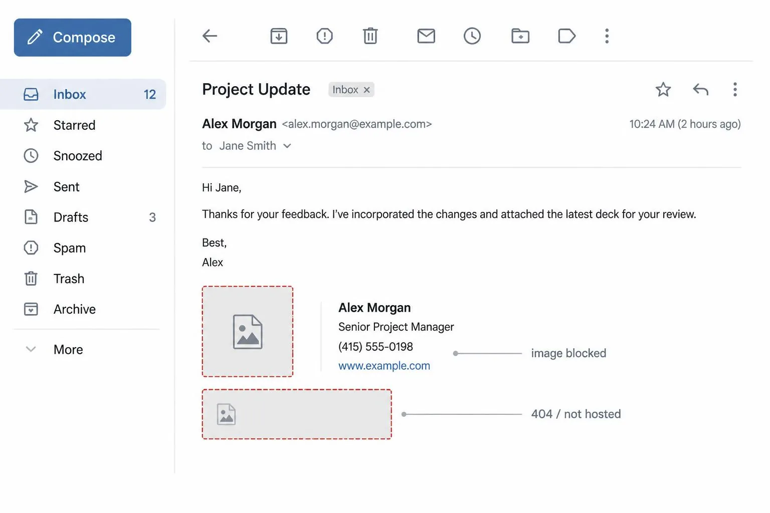
A missing logo has three possible explanations, and they are worth separating because the fixes are unrelated.
The image is not hosted. If you dragged a file into the signature editor, some clients embed it as a base64 data URI or as an attachment. Gmail strips data URIs in signatures. Outlook turns embedded images into attachments, which is why recipients get a paperclip and a suspicious-looking `image001.png`. Every image in a signature must live at a public HTTPS URL that returns a 200 to a stranger with no cookies. Test it: open the image URL in a private browsing window. If you have to log in, so does your reader, and they will not.
The image is blocked. Most clients block remote images by default until the reader clicks "display images". This is not a bug and you cannot fix it — you can only design around it. The rule is that no essential information may live inside an image. Name, title and phone number go in text. If your entire signature is one exported PNG, blocking turns it into an empty box; we went through the full cost of that trade in HTML vs image signatures.
The image loads but looks wrong. Blurry usually means you set no explicit dimensions, or set them larger than the file. Serve the image at twice the display size and declare the display size in `width` and `height` attributes on the tag, not in CSS. Outlook ignores plenty of CSS; it respects HTML attributes.
Layout that falls apart in Outlook
Outlook on Windows renders HTML with Microsoft Word's engine. Word does not support flexbox, grid, `float`, `position`, `max-width`, background images, or margins in most contexts. When your two-column signature stacks itself into one sad ribbon of text, this is why.
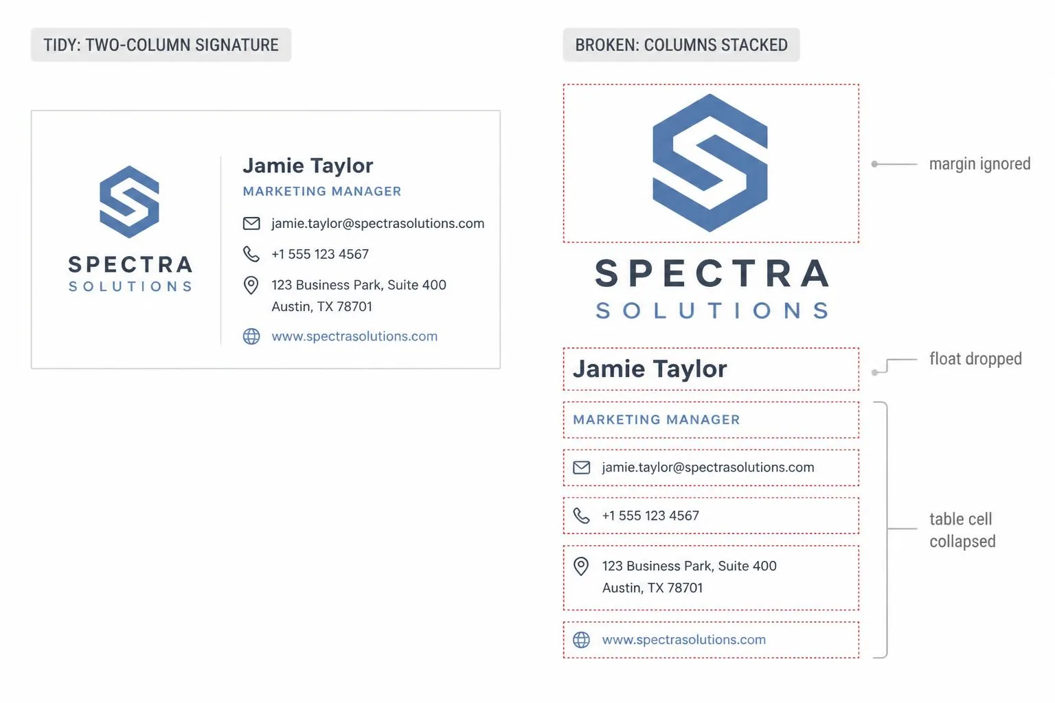
The fix is old-fashioned and reliable: nested tables with `cellpadding`, `cellspacing` and `border="0"`, inline styles on every element, and spacing produced by padding inside table cells rather than margins between them. Use `<td>` widths in pixels. Avoid shorthand properties like `font` and `background` — several clients drop them.
If a gap appears where you did not put one, look for whitespace between your `<td>` tags in the source. Some clients render it as a text node. Closing tags should sit flush against the next opening tag.
The signature is too wide on a phone
Over half of your recipients will read the message on a screen about 360 CSS pixels wide. A signature built as a fixed 600 or 650 pixel table will either force horizontal scrolling or get shrunk to unreadable text, depending on the client.
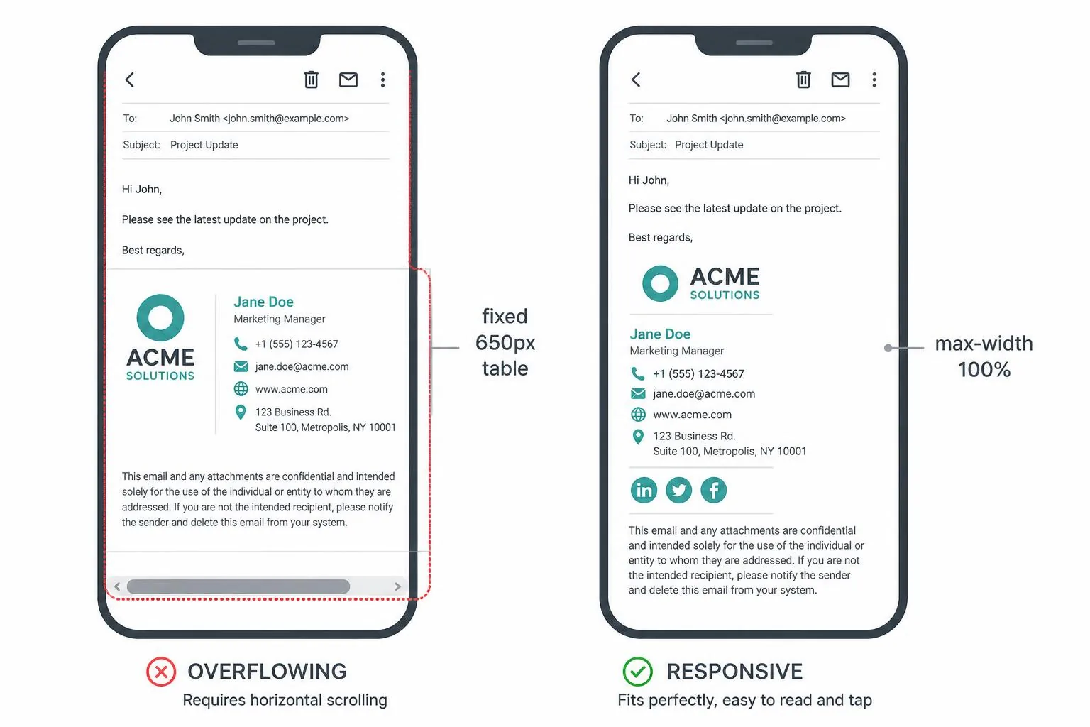
Keep the outer table under 400 pixels wide and you sidestep the whole problem — no media queries, no stacking logic, nothing to test. A signature is four to six short lines. It does not need the full column width. Set `width="100%"` with `style="max-width:380px"` on the outer table and let it be narrow on the desktop too; nobody has ever complained about a compact sign-off.
Also make links tappable. A phone number rendered as plain text is fine on a laptop and annoying on a phone. Wrap it in `<a href="tel:+15551234567">` and give it at least 44 pixels of vertical tap area.
Fonts, colours and dark mode
Web fonts do not load in most email clients. If you specify only your brand typeface, the client silently substitutes something and your careful spacing shifts. Always write a full stack ending in a system font: `font-family: Arial, Helvetica, sans-serif`.
Dark mode is the newer version of this problem. Several clients invert light backgrounds automatically, which turns dark grey text into light grey text on a dark background — usually fine — and turns your logo's invisible white background into a visible white rectangle. Use a transparent PNG, and avoid pure black or pure white text so that inversion has somewhere to go. There is more on dark-mode behaviour in the email signature mistakes post.
Links that go nowhere
Three link failures account for nearly all of them.
The first is a missing scheme. `href="getbrandsig.com"` is a relative path; clients resolve it against their own domain and produce a 404. Always write the full `https://`.
The second is mismatched anchor text. If the visible text says one domain and the `href` points at another — a tracking redirector, usually — spam filters read that as a phishing pattern. Keep them the same, or use a non-URL label.
The third is the auto-linkifier. Some clients turn bare URLs and phone numbers into links themselves, wrapping them in their own blue underlined style that fights whatever you set. Link things explicitly so there is nothing left for the client to guess at.
The quick reference
| Symptom | Likely cause | Where it shows up | Fix |
|---|---|---|---|
| Broken image icon | Image not publicly hosted | Everywhere, all recipients | Move to a public HTTPS URL, test in private browsing |
| Blank box where the logo was | Remote images blocked by default | Outlook, Gmail on first view | Keep all text as text; treat the image as decoration |
| Blurry logo | No explicit dimensions, or upscaled file | Retina laptops and phones | Export at 2× and set `width`/`height` attributes |
| Columns stacked vertically | `float`, flexbox or grid in the markup | Outlook on Windows | Rebuild with nested tables and cell padding |
| Random gaps between rows | Whitespace between table tags | Outlook, some webmail | Remove whitespace between `<td>` elements |
| Needs sideways scrolling | Fixed table width over 400px | Phones | Cap the outer table at ~380px |
| Wrong typeface | Web font not available | Most clients | Full font stack ending in a system font |
| White box behind the logo | Opaque background in dark mode | Apple Mail, Outlook dark themes | Transparent PNG, avoid pure black/white |
| Link 404s | Missing `https://` | Everywhere | Write absolute URLs |
| Signature arrives as an attachment | Image embedded rather than linked | Outlook | Reference a hosted URL instead of pasting the file |
The paste is the weakest step
Even a perfect signature can be destroyed on the way in. Gmail's signature box accepts rich text from the clipboard, not raw HTML, so pasting source code into it produces literal visible markup. You have to render the HTML first — in a browser tab or a generator — then copy the rendered result and paste that.
Outlook is worse: its editor rewrites what you paste, adding `mso-` properties and sometimes converting your table structure into something Word prefers. Build in the simplest possible HTML so there is less for it to mangle, and re-check after every edit in the client's own editor. The general principle, and the layout rules that survive it, are covered in the professional email signature guide and in our best-practice rules.
If none of this sounds like a good use of an afternoon, generate the signature instead — the output is table-based, inline-styled, and uses absolute image URLs, which removes six of the ten rows in the table above before you start.
Related reading
- HTML vs image signatures — why a single exported PNG fails the moment images are blocked.
- The professional email signature guide — the full picture: what to include, what to cut, how to lay it out.
- Seven email signature mistakes — the design failures that survive perfectly valid HTML.
- How to add a signature in Outlook (all four versions) — where the setting lives in each Outlook, and how to paste HTML without it collapsing.