Professional email signature examples: 10 layouts and when to use them
Ten practical email signature formats for founders, sales teams, consultants and everyday replies, with guidance on choosing the right amount of branding and detail.
Built in BrandSig
Choose a signature to start with
These are live renders of the ten BrandSig compositions. Pick one and the Studio will keep it selected while it builds the signature from your website.
Minimal
№01A dependable default for most professionals.
Use this templateLogo Left
№02For a company brand people already recognise.
Use this templatePhoto
№03For consultants and other relationship-led work.
Use this template
 +34 910 123 456


Founder
№04A personal introduction from the business owner.
Use this templateSales CTA
№05One focused next step for sales conversations.
Use this templateCompact
№06A lighter signature for replies and long threads.
Use this templateExecutive
№07Structured details for formal and regulated work.
Use this template
Card
№08Controlled brand color for creative businesses.
Use this templateBanner
№09A time-limited campaign, event or report.
Use this templateDuo
№10For a person representing two connected brands.
Use this templateThe best email signature is not the one with the most information. It is the one that helps the person reading your message understand who you are and take the next useful step.
That step changes with the sender. A consultant may need a direct phone number. A founder may benefit from a short personal line. A salesperson may want one focused call to action. The same person may even need two signatures: a fuller version for first messages and a compact one for replies.
The examples below cover ten useful layouts, from quiet text-only sign-offs to branded cards and campaign banners. Treat them as structures rather than scripts. Replace the sample details, remove anything that does not help your recipient and test the result in the mail apps your customers use.
Ten email signature formats at a glance
| Layout | Best for | Main strength | Watch out for |
|---|---|---|---|
| Minimal | Most professionals | Fast to scan and hard to break | Can feel generic without a clear role or company |
| Logo left | Small businesses and client teams | Connects the sender to the brand | An oversized logo can dominate the message |
| Photo | Consultants, recruiters and advisors | Makes a personal relationship easier to recognise | Use a current, professional image |
| Founder | Owners and executives | Adds context and a human voice | A long biography turns into clutter |
| Sales CTA | Sales and customer success | Gives the reader one obvious next step | Multiple buttons compete with the email itself |
| Compact | Replies and internal threads | Keeps repeated messages light | Too little context for a first introduction |
| Executive | Legal, finance and formal services | Organises several contact details clearly | Labels and disclaimers can make it dense |
| Card | Creative businesses and agencies | Carries more brand color without a banner | Strong backgrounds need careful contrast |
| Banner | Launches, events and time-limited offers | Makes one campaign visible | Stale promotions damage trust |
| Duo | People representing a parent company and sub-brand | Shows the person and organisation separately | Two brand marks can create visual noise |
1. Minimal: the dependable default
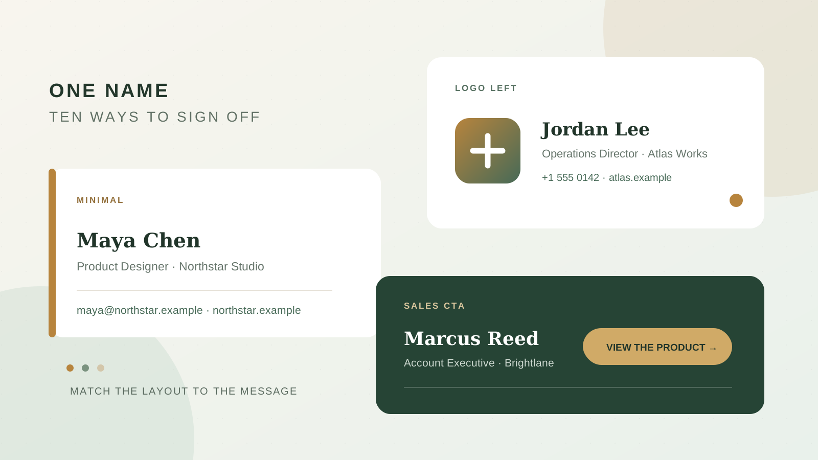
A minimal signature works for almost any role because it puts the sender before the decoration. Use a clear text hierarchy, one accent color and only the contact routes you actually answer.
Maya Chen
Product Designer · Northstar Studio
maya@northstar.example · northstar.example
This format is a strong starting point for freelancers, engineers, product teams and anyone whose email already contains the real message. It also survives narrow screens and image blocking because the essential information is text.
Add a phone number only if calls are a normal part of your work. Add LinkedIn only if the profile gives the recipient useful context. A row of five social icons does not make a minimal signature more complete; it makes the recipient decide which link matters.
2. Logo left: for a recognisable company brand
Place a modest logo beside the contact block when the organisation matters as much as the individual sender. This is useful for agencies, local businesses and client-facing teams where visual recognition helps connect the email to a website, proposal or invoice.
[Company logo]
Jordan Lee · Operations Director
Atlas Works
+1 555 0142 · atlas.example
Keep the logo visually smaller than the name block. The recipient should learn who wrote the email before they process the artwork. Give the image explicit dimensions and a descriptive alt value, then keep the name, company and contact details outside the image. If remote images are blocked, the signature should still make sense.
If you need help choosing and hosting the asset, the website-to-signature guide explains how to start with the logo and colors already used on your site.
3. Photo: for relationship-led work
A small portrait can help when clients buy expertise and work with the same person over time. Consultants, recruiters, coaches, real-estate agents and account managers are common fits.
[Portrait]
Priya Nair
Talent Partner · Field & Co.
priya@field.example · Book a conversation
Use a recent head-and-shoulders image with a simple background. Crop it consistently with the rest of your team's photos and keep it small enough that it does not turn every reply into a profile page. The portrait should support recognition, while the text carries the useful details.
A photo is less useful for shared inboxes, support queues or roles where several people speak for one address. In those cases, use the team or company name as the clearest identity.
4. Founder: for a personal note from the business
Founders often move between sales, partnerships, hiring and customer support. A founder signature can acknowledge that range without listing every responsibility.
Elena Ruiz
Founder, Common Ground
Practical tools for calmer team planning
commonground.example
The short descriptor is the useful part. It tells a new contact what the business does without making them decode a slogan. Write it in plain language and keep it to one line.
Avoid stacking investor logos, awards, press mentions and a full company mission underneath. Those details belong on the website linked from the signature. The email signature only needs enough context to make that click informed.
5. Sales CTA: one clear next step
A sales signature can include a call to action when it matches the conversation. The strongest version offers one specific step rather than a menu of choices.
Marcus Reed · Account Executive
Brightlane
+44 20 7946 0182
See a 15-minute product walkthrough →
Use language that tells the recipient what happens after the click. “Book a demo” is clearer than “Learn more,” and “Choose a support time” is clearer than a naked calendar URL.
Do not add a meeting button to sensitive, personal or purely operational messages where it feels unrelated. The booking-link etiquette guide covers when a calendar link saves time and when it shifts work onto the recipient.
6. Compact: the reply-thread version
Every repeated reply does not need a logo, address and campaign. A compact signature keeps long conversations readable and works well as the reply or forward default.
Sam Okafor · Customer Success
+1 555 0198 · sam@harbor.example
Create this as a second signature rather than continually deleting parts of the full one. Gmail and Outlook let you choose or assign different signatures, so a full introduction can appear on new messages and the short version can appear in replies.
Keep the same name, role and preferred contact route as the full signature. Consistency matters more than squeezing the block down to the absolute fewest characters.
7. Executive: structured and formal
An executive layout suits industries where the recipient expects a complete business identity: legal services, finance, property, procurement and enterprise partnerships.
Dr. Amina Shah
Managing Director
Meridian Advisory Group
Direct +44 20 7946 0124 · Office +44 20 7946 0100
24 King Street, London · meridian.example
Use labels when two phone numbers or locations would otherwise be ambiguous. Keep the typography quiet and align the details so the block is easy to scan.
Only add a legal disclaimer when your organisation requires one. If it is mandatory, separate it visually and keep it in smaller, readable text. Do not let boilerplate obscure the sender's identity or the message above it.
8. Card: controlled brand color
A card places the signature on a lightly tinted background or within a simple border. It gives creative studios, hospitality brands and design-led companies more visual presence without relying on a large image.
Theo Martin
Creative Director · Formhouse
Brand systems for growing teams
formhouse.example
Choose a pale tint behind dark text, or a dark brand color with text that has strong contrast. Links still need to look like links, and the card should remain legible if a mail client removes some styling.
Before using a filled background, send tests to Gmail and Outlook and open one on a phone. Email clients do not support CSS as consistently as browsers. The rendering standards guide explains why conservative HTML and inline styles remain useful here.
9. Banner: for a campaign with an end date
A banner works when there is one timely announcement worth repeating across a team: an event, report, seasonal collection or product release.
Nora Kim · Partnerships, Studio North
nora@studionorth.example
[New report: The 2026 guide to independent retail →]
Make the banner's destination and purpose obvious. Give the campaign an owner and a removal date before it goes live. A signature advertising last quarter's webinar tells recipients that no one is maintaining the details.
Keep the sender's normal identity outside the banner so it remains available when images are hidden. The promotional layer may disappear; the signature should not.
10. Duo: person first, company second
A duo layout separates the individual's contact block from a second company or product block. It fits consultants with a studio name, teams representing a product within a larger company, or organisations that need to show both a local office and a parent brand.
Lucas Almeida · Community Lead
lucas@loop.example · +351 21 555 0140
Loop, a River Group company · loop.example
The reading order should stay clear: person, role, direct contact, organisation. Use one primary accent color and keep any second logo subordinate. If the relationship between the two names needs a paragraph to explain, link to an About page rather than placing the explanation in every email.
How to choose the right example
Start with the message and the recipient rather than your favourite visual style.
- For first contact: use Minimal, Logo Left, Photo, Founder or Executive so the recipient gets enough context.
- For active conversations: use Compact to reduce repetition.
- For a defined conversion goal: use Sales CTA, but keep the action relevant to the message.
- For a temporary announcement: use Banner and set an end date.
- For a brand with a strong visual system: use Card or Duo after testing contrast and mobile width.
If two layouts seem equally suitable, choose the simpler one. You can always add one useful element after testing; removing a crowded signature is harder once a whole team has copied it.
What every professional signature still needs
Regardless of layout, a professional signature should answer three questions quickly: who sent this, what is their role or company, and how should I continue the conversation?
Use your real display name, a recognisable role, the company name when it is not already obvious and one or two reliable contact routes. Make the website, email, phone number and optional call to action clickable. Keep essential information as text, use public HTTPS image URLs and avoid tiny type.
Then remove what has no job. An unused fax number, a motivational quote, duplicate email address or six social profiles makes the block longer without making it more useful. The seven signature mistakes guide has a practical removal checklist.
Build a version from your own brand
You can recreate any of these structures in the BrandSig editor. Enter your website URL to pull in a starting logo, company name and brand color, then correct the details and switch between the ten layouts in the preview.
Use the template as a composition, not a requirement to fill every field. Minimal may need only a name, role and website. Photo needs an image that earns its space. Sales CTA needs one useful destination. Compact works because it leaves things out.
When the content is ready, copy the rendered signature into your mail client's signature editor. Use the specific setup guide for Gmail, Outlook or Apple Mail.
Test the example you choose
Send a real message to another account before rolling the signature out. Open it on desktop and mobile, with images loaded and hidden. Click every link. Reply once to see how much space the block takes in a thread.
The right example will still identify you when the styling is reduced, will not overpower a two-line email and will give the recipient one clear route forward. That is a better standard than trying to include everything a signature could possibly hold.