
Email signatures for sales teams: templates, CTAs and rollout
Create sales signatures that support replies without looking like ads, choose one useful CTA and roll out consistent templates across the team.
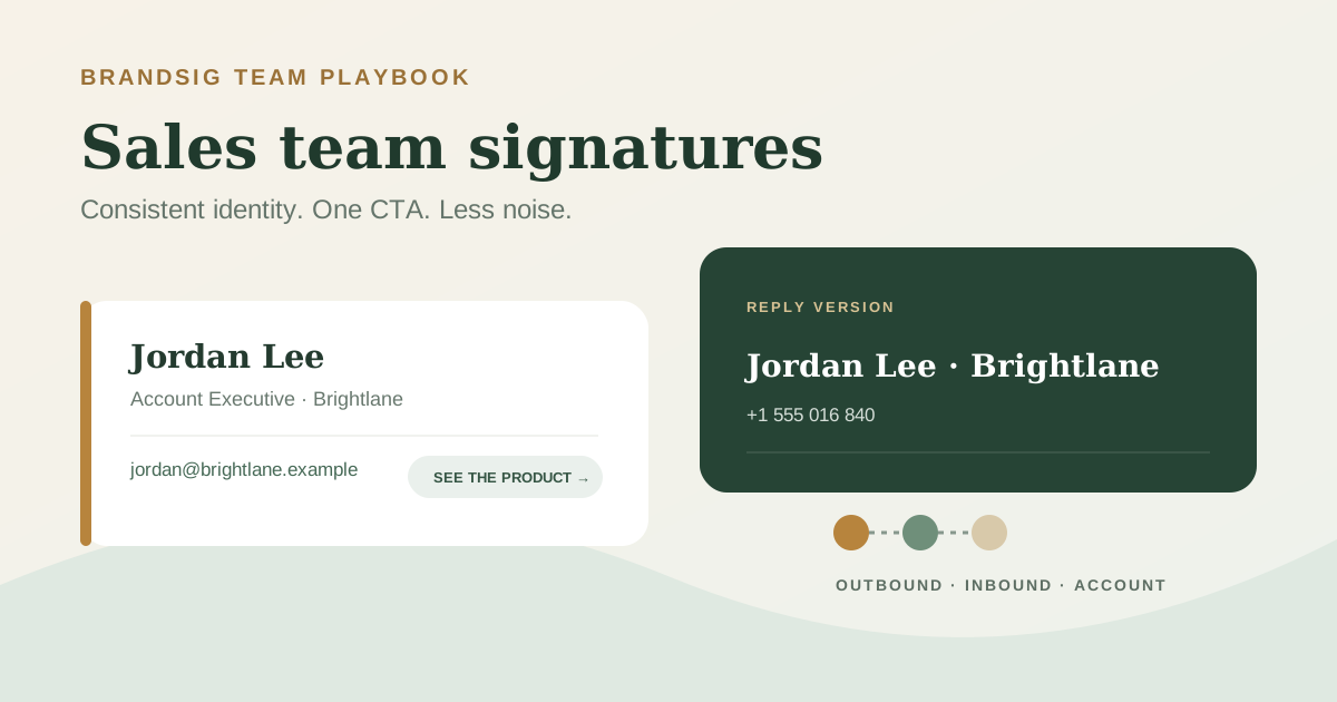
A sales signature should make a reply easier, not make the email look like a display ad. The recipient needs to know who is writing, which company they represent and how to continue the conversation. Everything else has to earn its place.
The best system gives the team a small set of controlled templates instead of one overloaded design or dozens of individual variations.
Start with the job of the message
| Sales motion | Best signature emphasis | CTA |
|---|---|---|
| Cold outbound | Identity and credibility | Usually none, or a quiet company link |
| Inbound qualification | Fast contact and scheduling | “Choose a time” |
| Product-led sales | Role and product context | “See the product” |
| Account management | Direct access and continuity | Phone or customer portal |
| Partnerships | Company context and trust | Partner page or company overview |
One design does not have to serve every stage. A first-touch message benefits from restraint; a reply to someone who requested a demo can make the calendar link explicit.
A practical sales signature template
Jordan Lee Account Executive · Brightlane +1 555 016 840 · jordan@brightlane.example See how Brightlane works
For replies after a meeting is agreed, replace the product link with Choose a time. Do not place both actions in the same compact block unless the recipient genuinely needs both.
Create the approved versions in BrandSig, then give representatives controlled fields for their name, role, number and regional details.
Match the CTA to the recipient’s intent
A calendar link is helpful when the reader already wants a conversation. In cold outreach, an oversized BOOK A DEMO button asks a stranger to do scheduling work before they have agreed to the meeting.
Use neutral, descriptive labels:
- See the product
- View customer stories
- Choose a time
- Contact support
- Visit our partner page
Avoid urgent language, multiple buttons and campaign slogans in the permanent signature. The booking link etiquette guide covers when a calendar link feels convenient and when it feels presumptuous.
Build full and reply versions
The full version can include a small logo, direct phone number and one CTA. The reply version should usually be two or three lines: name, company and one contact route.
This matters in sales because threads grow quickly. A large signature repeated after every “Sounds good” makes the conversation harder to scan and can expose an aggressive CTA long after it is relevant.
Set the full design for new external messages and the compact version for replies where the email client allows separate defaults.
Be careful with tracking
Marketing teams often want campaign parameters on signature links. Add them consistently and document what they measure. A signature click is not the same as a click from a campaign email, so give it its own source and medium.
Do not route every link through an unfamiliar redirect domain. Recipients who hover over the company link expect to see the company’s domain, and security-conscious organizations evaluate redirects carefully. Prefer transparent first-party destinations.
Measure useful outcomes—qualified visits, bookings or replies—not raw clicks alone. A curiosity click from an internal colleague is not pipeline.
Standardize the data before the design
Before rollout, define the source of truth for:
- Preferred name.
- Job title.
- Territory or office.
- Direct phone number.
- Company and product naming.
- Approved CTA by role.
- Required regional or legal text.
Empty optional fields should remove the complete row. Do not leave labels such as “Mobile:” or separators with no value. Normalize titles and phone formats before generating signatures; otherwise a consistent template will only make inconsistent data more visible.
Give representatives the right amount of control
Lock brand colors, spacing, logo assets and HTML structure. Let people edit approved personal fields. Decide whether pronouns, certifications or local office details are optional, required or unavailable.
This is a governance decision, not only a design decision. If every rep can paste arbitrary banners and quotes, the team no longer has a signature system. If nobody can correct a stale phone number, the system will be ignored.
Avoid deliverability theatre
No single signature element guarantees inbox placement. Still, a compact design avoids several avoidable problems: excessive image weight, URL-heavy blocks, broken remote assets and a poor text-to-image balance.
Keep the essential identity as live text. Use one small logo instead of a flattened signature image. Host assets on HTTPS and remove promotional banners when the campaign ends. The email signature best-practices guide covers dimensions, fonts and client-safe markup.
Roll out with a pilot
Start with a small group that represents the real sales organization: outbound, inbound, account management, mobile-heavy users and at least one person with an alias or regional variation.
Test Gmail, Outlook, mobile, new messages and long replies. Confirm that the correct version appears for each sending address, links resolve to the approved destination and images remain legible in dark mode.
Then launch in stages, keep a rollback copy of the old signature and assign an owner for future changes. A sales signature stays useful when it is treated as maintained infrastructure, not a one-time design file.